This week I felt like I turned a corner with this project because I was actually excited about the finished product.
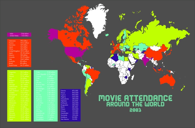
My color refined draft. I am actually really happy with the direction I took it. I had experimented with using film strips and other film paraphernalia but it didn’t do what it was supposed to do and that is show the data. I like my color choices but a thought I had that I would experiment with is changing them to the Technicolor colors. I think that would be a cute nod to the change in film from black and white to color.
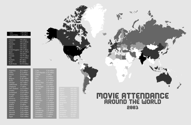
My black and white refined draft. I think it actually looks really pretty. I am concerned about the last set of data box because the color is too light and you might not be able to read the actual data. I also might work on the background and make it white have the countries with no data just fade into the background. My concern with that is that most of Africa would be gone and it might look weird.
My form centric refined draft. It took me forever to find VHS tapes that I could tear up to create this data map. I chose to use the top country from each category in my data map so that there would be a distinct difference in sizes. I will put this on a white board so that it can be moved and displayed but for now they are on my kitchen floor. I am also planning on creating stickers with the country flag so that it cuts up the stark black and white imagery. Although on the other hang it might be kind of cool to just put stickers on the tape and write out the information with a sharpie, like you would have on a home video.


1. Did the students include the minimum requirements this week? (Re-read Project 02: Mapping–Steps 3 for details.)
I think so.
2. What was working well and what could have been improved in their final maps?
I think that the bright colors are really fun. I like how they correlated with the boxes. That makes it easy to follow. I am finding it difficult to read the text in the yellow and green boxes though. However, in your grayscale version everything is clear.
I also like the concept of the VHS tapes. That is really fun and I like how it correlates! Are you going to put it on anything? If you put it on a board or something, you might be able to add the country stickers underneath each pile and keep the handwritten on the actual tapes. I do kind of like the handwritten as well but printing it out might be more legible from a distance.
3. Name at least 2 students who’s work was well done and could help inspire the other students in your group.
Jordan’s data is really easy to read. He organized it in a way that works really well and the text color is working too.
Your form-centric map reminded me a little of Manny’s. He is also using items (quarters) to show the amount for his countries/continents.
4. Include other feedback as appropriate.
So far I think this all has a lot of potential. I think you really only have small tweaks to make and then you are set. Good job! 🙂
1. Did the students include the minimum requirements this week? (Re-read Project 02: Mapping–Steps 3 for details.)
Yes.
2. What was working well and what could have been improved in their final maps?
I think your black and white map is almost perfect. It looks great. The color one looks good, but almost a little too colorful. At least, I think the colors are a little too harsh. I think if you toned them down it would help the effect. Your form-centric ones are neat. I think they turned out well
3. Name at least 2 students who’s work was well done and could help inspire the other students in your group.
From what I could see of her’s, Josette Clark’s turned out great. Hailey Cram’s is also one to look at.
4. Include other feedback as appropriate.
I think the project is looking great. I would just try and change the colors on the color map.
Great job on your maps. They’re really looking like you’re almost to the finished point! I think that your colors are really distracting from the concept of your design. What I found worked really good for me to solve that problem was do some research on color schemes. I found a color scheme where the colors differentiated enough that you could tell the difference, but they sat well with each other.
Because of the distracting coloring, your black and white data centric map is much stronger. I think it looks really good! Take into consideration hierarchy when doing your final touches.
I think your form focused refinement is looking good. I think you should make the text stand out waaaaay more than it already is. It is really blending in too much with the black tape. I like the idea though, so I think you definitely have that going for you. Keep pushing your concepts even further and you will have a great composition!